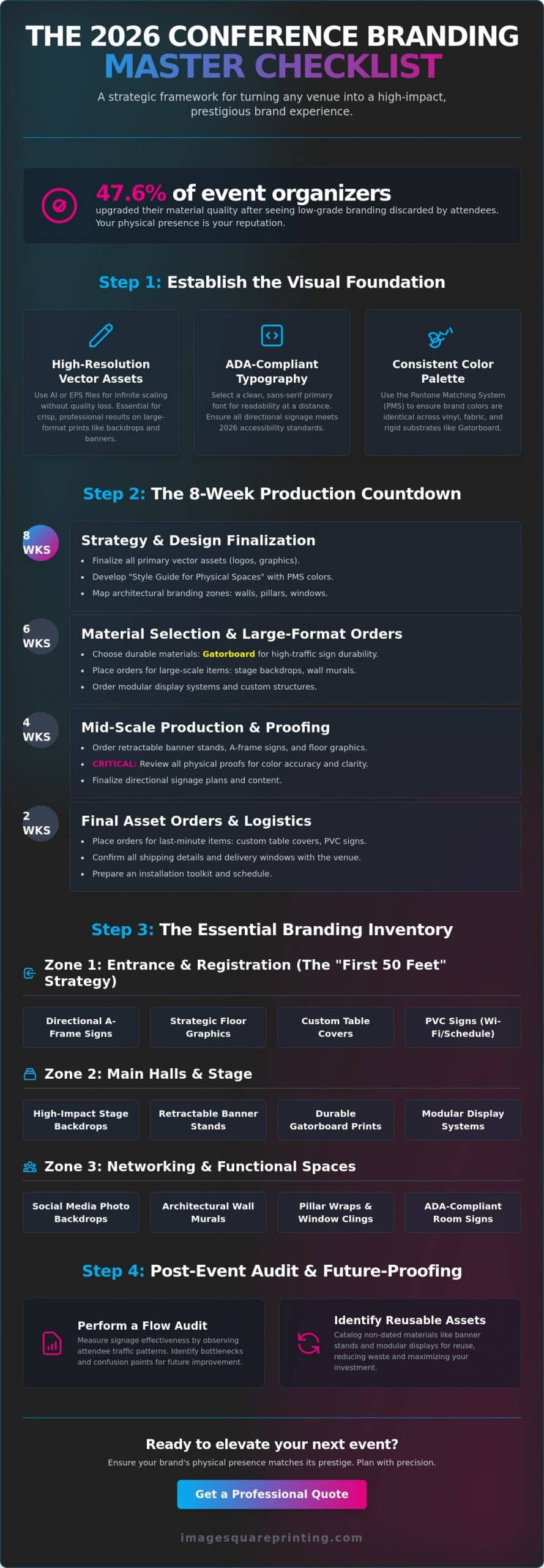
Did you know that 47.6% of event organizers recently upgraded the quality of their materials after watching low-grade branding get discarded by attendees? It’s a stark reminder that in a high-stakes environment, your physical presence is your reputation. If you’ve ever worried about a sign failing in a high-traffic zone or a backdrop looking washed out under stage lights, you aren’t alone. Balancing tight production timelines with the need for durability is a challenge even for seasoned planners. This is why having a definitive event branding checklist for conferences is no longer optional; it’s a strategic necessity for 2026.
We understand that you need more than just decor. You need a cohesive, professional-looking space that guides attendees effortlessly through their journey. This article promises to help you master every physical touchpoint using a framework designed for maximum visual impact. We will preview the essential components of a successful rollout, from 2026 ADA-compliant directional signs to high-impact social media backdrops and modular display systems. By the end, you’ll have the technical precision and creative confidence to turn any venue into a prestigious brand experience.
Key Takeaways
- Learn how to scale your conference theme across large environments using high-resolution vector assets for crisp, professional results.
- Use this comprehensive event branding checklist for conferences to secure essential assets like retractable banner stands and custom table covers.
- Implement the “First 50 Feet” strategy to capture attendee attention immediately with strategic floor graphics and entryway displays.
- Manage production timelines with an 8-week countdown and learn why it’s vital to choose Gatorboard prints for high-traffic durability.
- Perform a post-event flow audit to measure signage effectiveness and identify materials ready for re-use in your next production cycle.
Establishing the Visual Identity: The Foundation of Conference Branding
Every professional event branding checklist for conferences begins with a robust visual identity. It’s the blueprint that ensures your 2026 conference theme scales perfectly from a 2-inch smartphone screen to a 40-foot stage backdrop. Achieving this requires moving beyond basic logo placement. You must establish a strategic foundation grounded in Corporate Branding Principles to ensure your message remains clear and authoritative across every square foot of the venue. This initial phase sets the tone for the entire attendee experience, moving quickly from a conceptual idea to a tangible, high-impact environment.
High-resolution vector assets are your most critical technical requirement for this stage. Unlike raster images that pixelate and blur when enlarged, vector files allow for infinite scaling without any loss of quality. This precision is vital for large-scale output where even minor imperfections become glaring errors under bright venue lights. We recommend finalizing all primary assets in AI or EPS formats at least eight weeks before your event to avoid production bottlenecks and ensure your visual prestige is maintained across all physical touchpoints.
The Core Visual Framework
Readability at a distance is a science, not a suggestion. You should select a primary typeface that is clean and legible, typically a sans-serif font like Helvetica or Arial to meet 2026 ADA standards for signage. Your secondary typeface can carry more of the brand’s creative personality but should be reserved for tertiary information. Consistency across different materials is achieved through the Pantone Matching System (PMS). Since colors appear differently on vinyl, fabric, and rigid substrates, specifying PMS codes ensures your brand’s signature palette looks the same on a registration desk as it does on a hanging banner. Creating a “Style Guide for Physical Spaces” allows you to maintain this control even when working with multiple production partners.
Architectural Branding Strategy
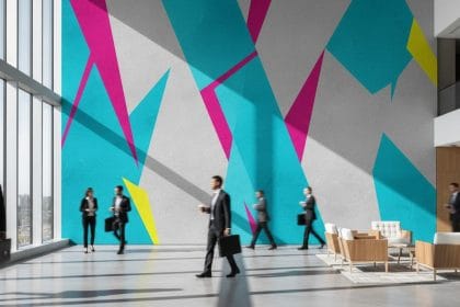
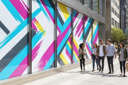
A truly immersive conference experience integrates brand elements directly into the existing venue architecture. You can use wall murals to transform generic hotel ballrooms into sophisticated, branded environments that feel custom-built for your organization. Don’t overlook functional spaces like structural pillars, window banks, and elevators. These are “blank canvas” areas that maximize your visual real estate without cluttering the main floor. By mapping these zones early, you develop a hierarchy of information that guides attendees through the space while reinforcing brand authority at every turn.
The Essential Physical Branding Inventory for 2026
A comprehensive physical inventory transforms a conceptual theme into a tangible reality that attendees can touch, feel, and experience. When building your event branding checklist for conferences, you must prioritize assets that offer both high visibility and functional utility. These physical touchpoints are the primary drivers of Event Branding ROI, turning passive observers into active brand ambassadors. We focus on high-stakes production where durability meets aesthetic precision, ensuring your brand maintains its prestige from the moment the doors open until the final keynote concludes.
Entrance and Registration Essentials
The registration area is your first opportunity to establish brand authority. You don’t want attendees squinting at taped-up paper signs or generic desks. Instead, utilize custom table covers to turn standard rental furniture into professional, branded workstations. Supplement these with high-resolution PVC signs for Wi-Fi instructions, schedule overviews, and QR code check-ins. To handle the initial flow of foot traffic, place directional A-frame signs strategically in the lobby to prevent bottlenecks and guide guests toward the main hall.
Session and Stage Branding
Once attendees move into the main halls, the focus shifts to the stage where the most significant brand impressions occur. Professional step and repeat backdrops are essential for VIP photo opportunities and media interviews. This isn’t just a background; it’s a strategic asset designed for social media sharing. For the stage itself, tension fabric displays offer a seamless, non-reflective surface that looks crisp under intense studio lighting. You should also deploy retractable banner stands stage-left and stage-right to frame the speaker and reinforce the conference theme in every attendee photo.
Wayfinding is a critical but often overlooked component of the physical inventory. High-traffic areas require floor decals that won’t peel or slip, guiding attendees toward breakout rooms without the need for constant staff intervention. For outdoor components, remember that readability is paramount. Following standard visibility rules, ensure your letter height follows the 1-inch-per-10-feet viewing distance guideline, increasing this by 30% for outdoor conditions to account for glare and environmental factors. If you’re looking to elevate the experience further, consider a dedicated “Social Media Wall” that encourages attendee-generated content through vibrant, tactile graphics. If you’re unsure which materials will hold up in your specific venue, our team can help you select the right tradeshow materials for your layout.
Zone-by-Zone Signage Planning: Navigating the Conference Space
The first 50 feet of a venue determine an attendee’s perception of the entire event. This is why your event branding checklist for conferences must include a detailed zone-by-zone signage plan. Instead of scattering signs where they simply look good, we use a flow-based strategy to capture attention at the main entrance and maintain it throughout the day. By identifying hot zones, which are areas with the highest dwell time, you ensure your brand and your sponsors’ logos receive maximum exposure without overwhelming the space. This methodical approach transforms a generic venue into a high-impact, branded environment.
Wayfinding is the most functional part of this strategy. We utilize high-durability floor graphics to lead attendees toward breakout rooms and keynote halls. These aren’t just stickers; they’re strategic markers that reduce friction in the attendee journey. Transition zones like elevators, escalators, and long hallways are often overlooked, yet they offer prime real estate for immersive branding that keeps the momentum going between sessions. When you brand these in-between spaces, you eliminate dead zones and keep the energy of the conference alive.
High-Traffic Navigation Strategy
In high-traffic areas, flexibility is your greatest asset. We recommend using retractable banner stands as modular wayfinding tools. They’re easy to reposition if you notice a specific hallway becoming congested or if a room change occurs. Pair these with large-scale “You Are Here” maps printed on rigid pedestal boards to provide a sense of orientation. For a truly unique touch that creates a buzz, consider mirror printing in restrooms. It’s an unexpected branding moment that often ends up on social media, extending your reach beyond the physical venue walls.
Lounge and Networking Area Branding
Lounges serve as the social hub of your conference, making them ideal for high-end branding materials. You can brand charging stations and use custom furniture wraps to maintain a cohesive aesthetic even in relaxation zones. If your breakout sessions suffer from noise bleed, acoustic-friendly fabric posters provide a dual benefit: they absorb sound while displaying vibrant, high-resolution graphics. For catering zones and VIP lounges, acrylic signs offer a sophisticated finish for menu boards or reserved seating indicators. These details reassure your guests that they’re in a premium, well-curated environment designed with their comfort in mind.
Production Timelines and Material Selection Specs
The 8-week countdown marks the threshold where strategy meets execution. As you finalize your event branding checklist for conferences, this window is your deadline for locking in high-resolution art for large-format production. Rushing this stage often leads to compromise. We ensure that every file undergoes a rigorous pre-flight check to optimize resolution for the specific output size. This technical precision prevents the disappointment of blurred graphics on a 10-foot display, maintaining the visual prestige your brand demands. Planning early allows for proper color proofing and substrate testing, ensuring the final product matches your vision exactly.
Choosing the correct substrate is a decision based on environment and duration. While many organizers opt for standard materials, we recommend Gatorboard prints for high-traffic areas where durability is non-negotiable. Unlike lightweight foam core, Gatorboard resists warping and denting, making it the superior choice for professional pedestal signs and wayfinding boards. For outdoor zones, we utilize UV-resistant inks to prevent color fading and wind-permeable mesh for large-scale banners to ensure safety and longevity. These technical specifications are what separate a DIY effort from a professional, master-crafted environment.
Choosing the Right Substrate
Strategic material selection balances budget with impact. For events that recur annually, investing in aluminum signs ensures multi-year usage without degradation. Conversely, foam core boards provide excellent short-term budget efficiency for temporary informational signage. When you need massive outdoor visibility, vinyl banners offer the necessary scale and weather resistance to capture attention from a distance. Each material serves a specific tactical purpose within your overall branding framework.
Installation and Logistics
Successful branding isn’t just about printing; it’s about seamless integration. You must coordinate on-site mounting with venue staff, paying close attention to local union requirements and load-in schedules. We simplify this process through our corporate portal, which allows for multi-location distribution and standardized ordering across different regions. Post-event, we help you plan for professional removal and material recycling to align with 2026 sustainability standards. If you’re ready to start your production cycle, you can upload your artwork for a professional pre-flight review today to ensure your files are production-ready.
Post-Event Branding Audit and Sustainable Future-Proofing
The final stage of a professional production isn’t the load-out; it’s the audit. A successful event branding checklist for conferences must conclude with a rigorous assessment of how every physical asset performed in the field. This process allows you to separate high-impact solutions from underperforming materials, ensuring your 2027 strategy is even more precise. We recommend conducting a walk-through immediately after the final session to evaluate the wear and tear on your substrates. If you utilized premium Gatorboard or aluminum signs as discussed in previous sections, you’ll likely find these assets ready for multiple future deployments, maximizing your long-term investment.
Conducting an “Attendee Flow Audit” provides invaluable data on your wayfinding strategy. Analyze the physical condition of your floor graphics and directional A-frames. Heavy scuffing in specific zones confirms high traffic, while pristine signs might suggest a “dead zone” that requires a different approach next year. This technical feedback loop ensures your next layout is optimized for better engagement. Sustainability is also a non-negotiable standard in 2026. You should coordinate eco-friendly disposal or recycling programs for any single-use large-format graphics, while carefully storing modular assets like retractable banner stands and podium wraps in climate-controlled environments to prevent material degradation.
Measuring Branding ROI
Quantifying the success of your visual environment requires looking at both digital and physical data points. Analyze social media mentions specifically tied to your branded “photo zones” and the professional step and repeat backdrops we implemented. These secondary impressions extend your brand’s reach far beyond the venue’s walls. You should also gather direct feedback from event partners. Did their logos on your sponsor visibility zones meet their expectations for prominence? Calculating the cost-per-impression for high-visibility outdoor assets helps justify the budget for premium materials in future production cycles, proving that quality drives measurable business value.
Finalizing the 2026 Event Report
Documentation is the bridge to your next successful conference. Your final report should include a master asset list that details the quantity, material specs, and current condition of every item in your inventory. Document the physical setup with high-resolution photos to provide a visual reference for future planning committees. This ensures brand consistency remains intact even if your internal team shifts. By treating your branding as a repeatable, scalable framework, you remove the friction from future ordering processes. Ready to bring your 2026 conference to life? Explore our trade show and convention printing solutions today to secure the high-impact materials your brand deserves.
Command the Room with Precision Branding
Success in the 2026 conference circuit requires a shift from simple decoration to strategic environmental navigation. By prioritizing high-resolution vector assets and choosing durable substrates like Gatorboard, you ensure your brand maintains its prestige under high-pressure conditions. Implementing a zone-by-zone strategy transforms generic venues into immersive brand experiences that drive attendee engagement and measurable ROI. This event branding checklist for conferences serves as your operational blueprint for a flawless rollout, ensuring no detail is overlooked in the race to the finish line.
At Image Square Printing, we bring over 20 years of large-format expertise to every high-stakes project. We offer national shipping and professional installation services to guarantee your vision is realized exactly as planned, regardless of the venue. For high-volume event management, our corporate portals provide a streamlined solution for maintaining brand consistency across multiple locations and dates. You don’t have to manage these complex production timelines alone. Get a Custom Quote for Your 2026 Conference Branding and let’s build an environment that leaves a lasting impression on every attendee.
Frequently Asked Questions
What is the most important physical branding element for a conference?
Clear wayfinding is arguably the most critical physical element because it directly impacts attendee satisfaction and safety. While stage backdrops provide visual impact, a lack of clear directional signage leads to frustration and missed sessions. Your event branding checklist for conferences should prioritize high-visibility floor graphics and A-frame signs that guide guests effortlessly through the venue. This functional approach ensures your brand is associated with a seamless, professional experience rather than logistical confusion.
How far in advance should I order my conference signage?
You should finalize your art and send it to production at least 4 to 6 weeks before your event date. Strategic planning usually begins 3 to 4 months out to identify all necessary materials. Early ordering avoids expedited shipping fees and allows time for a professional pre-flight review of your files. This timeline ensures that every banner and display is produced with the technical precision required for high-stakes corporate environments.
Which materials are best for outdoor conference branding?
Heavy-duty vinyl and wind-permeable mesh are the industry standards for outdoor branding due to their weather resistance. If you need rigid signage, aluminum is the superior choice because it doesn’t warp or rust in varying environmental conditions. We also utilize UV-resistant inks to prevent color fading from sun exposure. These high-performance materials ensure your brand looks prestigious and remains secure even in high-wind or high-moisture outdoor settings.
How do I ensure my brand colors look the same on fabric and vinyl?
Using the Pantone Matching System (PMS) is the only way to ensure color consistency across different substrates. Since fabric absorbs ink differently than non-porous vinyl, specifying PMS codes allows production teams to calibrate printers for a visual match. It’s also helpful to request physical proofs or “strike-offs” on each specific material before a full production run. This meticulous approach protects your brand identity and ensures a cohesive look throughout the space.
Can I reuse my conference banners for multiple years?
Yes, you can reuse conference banners if you invest in high-quality materials and store them correctly. Retractable banner stands and aluminum signs are designed for longevity and can withstand multiple deployments. To prevent damage, always roll vinyl banners with the graphics facing out and store them in a climate-controlled area. Avoiding date-specific text on your primary assets is a strategic way to extend the lifespan of your physical inventory.
What is a step and repeat backdrop and why do I need one?
A step and repeat backdrop is a display featuring a repeating pattern of sponsor and event logos, typically used as a background for photography. You need one to encourage attendee engagement and generate high-impact social media content. When guests share photos from the VIP photo zone, your brand reaches an audience far beyond the physical venue. It’s a high-ROI asset that serves as a consistent brand anchor for media interviews and keynote sessions.
Do I need professional installation for large-format wall graphics?
Professional installation is highly recommended for large-format wall murals and custom wall coverings to ensure a bubble-free, seamless finish. While smaller decals might be manageable for your team, massive architectural graphics require specific tools and expertise to align panels correctly. Professionals also understand venue-specific requirements and union regulations, which removes friction from the setup process. This ensures your high-visibility graphics look polished and permanent rather than temporary or DIY.
How do I optimize my logo files for large-format printing?
You must use vector-based files such as AI, EPS, or high-resolution PDFs to ensure your logo remains crisp at any scale. Unlike raster images that blur when enlarged, vector graphics are based on mathematical paths that allow for infinite scaling without quality loss. For your event branding checklist for conferences, ensure all assets are built in the CMYK color space and have fonts outlined. This technical preparation is the foundation of a sharp, professional-looking physical environment.