Scaling a design for a 20-foot vinyl banner is not just a matter of dragging a corner in Adobe Illustrator. It is a high-stakes engineering task where a single resolution error can turn a prestigious brand asset into a blurry, expensive mistake. Knowing how to prepare files for large format printing is the difference between a wasted budget and a visual masterpiece. You’ve likely felt that wave of anxiety when hitting “send” on a massive file, wondering if the colors will shift or if the clarity will hold up once it’s printed at ten times its original size. It’s a common frustration for even the most seasoned designers, but it doesn’t have to be your reality.
We’ll help you master the technical specifications required to transform your digital designs into crisp, high-impact graphics without resolution or color errors. This guide provides a deep dive into professional scaling techniques, the nuances of CMYK color matching, and the industry standard PDF/X-4 format. From setting 0.25-inch bleeds to understanding rich black, you’ll gain the knowledge needed to ensure a perfect print on the very first try. Whether you are prepping mesh banners, retractable stands, or intricate wall murals, these standards ensure your vision is realized with absolute precision and professional prestige.
Key Takeaways
- Eliminate pixelation and the “staircase” effect by prioritizing vector graphics for all logos and typographic elements to ensure crisp edges at any scale.
- Navigate massive dimensions with ease by using the 1:10 scaling method, allowing you to maintain high resolution while keeping file sizes manageable for production.
- Master how to prepare files for large format printing with advanced color management techniques and ICC profiles that ensure your brand colors remain consistent across diverse materials.
- Protect your visual impact by implementing specialized bleed requirements and safety zones designed to account for large-scale hardware and finishing processes.
- Ensure a seamless transition from digital design to physical output by leveraging the PDF/X-4 standard as your definitive final export format.
Understanding Raster vs. Vector and the Resolution Myth
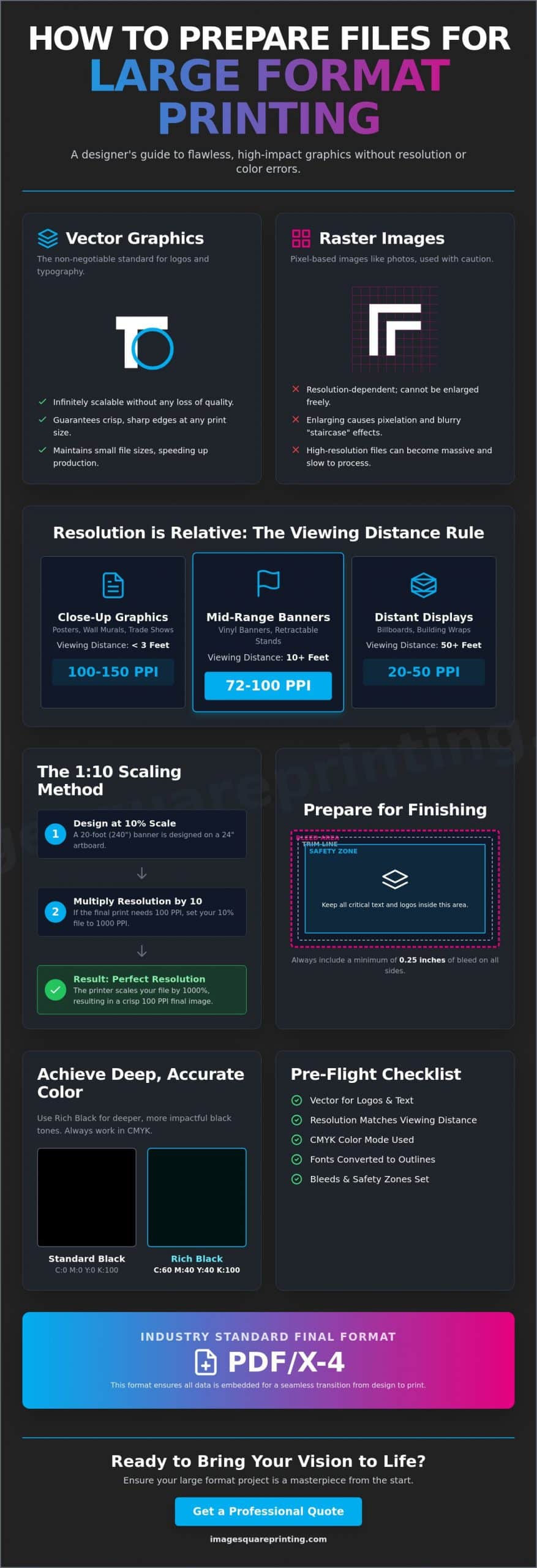
Resolution is the most misunderstood factor in wide-format production. Many designers default to 300 PPI because it’s the standard for brochures; however, applying this to a 40-foot banner creates a bloated file that crashes most RIP software. A foundational step in how to prepare files for large format printing is understanding vector graphics. Unlike raster images, which are made of fixed pixels, vectors use mathematical paths. This makes them non-negotiable for logos and typography. You can scale a vector logo from a business card to a stadium wrap without a single jagged edge or “staircase” effect.
Raster images, like photographs, have strict limitations. When you over-enlarge a raster file, the pixels stretch, creating visible distortion. To avoid this, you must distinguish between PPI (Pixels Per Inch) and DPI (Dots Per Inch). PPI refers to the digital file’s input, while DPI describes the physical ink droplets a printer places on the material. In large format, the goal isn’t just “more pixels.” It’s about providing the right amount of data for the intended viewing distance. Using 300 PPI for a billboard is not only unnecessary, it’s often detrimental to the production timeline.
The Viewing Distance Rule for Resolution
Clarity is relative to how far away the viewer stands. For large format poster printing or trade show graphics where people stand within three feet, you should aim for 100-150 PPI. This ensures crisp details for close-up inspection. For vinyl banners viewed from ten feet or more, 72-100 PPI provides perfect clarity to the human eye. Massive distance graphics, such as billboards or building wraps, often use as little as 20-30 PPI. At that scale, the individual pixels are huge, but they blend perfectly when viewed from a highway.
When to Use PSB Over PSD
High-resolution projects like custom wall coverings often exceed the capabilities of a standard Photoshop (PSD) file. PSD files have a 2GB limit and a 30,000-pixel maximum. If your file exceeds these specs, you must save it as a Large Document Format (PSB). PSB files support up to 300,000 pixels in any dimension, ensuring your high-impact murals remain manageable. Always ask your printer if they prefer flattened files or layered PSB documents. Flattening reduces file size, but keeping layers allows a prepress team to make critical color adjustments before the ink hits the substrate.
Mastering Scale and Document Setup for Massive Dimensions
Designing at full scale is often impossible due to software limitations and hardware constraints. To maintain a responsive workspace, professionals use the 1:10 scaling method. By setting your artboard to exactly 10% of the final size, you significantly reduce document overhead and prevent software crashes. However, you must adjust your resolution accordingly. If your target output is 150 PPI at full size, your 10% scale file must be set to 1500 PPI. This ensures that when the printer enlarges the file by 1000%, the resulting image remains crisp and professional. Understanding these ratios is a core component of how to prepare files for large format printing without sacrificing detail.
Maintaining aspect ratio consistency is vital to avoid image distortion. A slight mismatch between your artboard and the final print size leads to unintended cropping or stretching. If you are managing complex projects like custom wall coverings, set up each panel as an individual artboard within a single document. This approach keeps your multi-panel murals organized and ensures the design flows seamlessly across every seam. For those navigating these technical hurdles for the first time, consulting with large format printing experts can help verify your setup before production begins.
Scaling Effects, Strokes, and Gradients
When working at a reduced scale in Adobe Illustrator, you must enable the “Scale Strokes & Effects” setting. If this is ignored, a 10pt stroke on a 10% scale file will remain 10pt when enlarged; this results in lines that look far too thin on the final print. Gradients also require attention. Upscaling small gradients can cause visible banding, so it is often better to create these at a higher bit depth. Always convert live text to outlines. This prevents font substitution errors and ensures your typography remains a sharp vector shape regardless of the final dimensions.
Setting Up Artboards for Retractable Banners
Hardware requirements dictate your artboard setup for retractable banners. Most stands require a non-visible “leader” area at the bottom, typically around 6 inches, where the graphic remains tucked inside the base. Placing critical text or logos in this zone means they will never be seen. Similarly, leave a safety zone at the top for the hanger bar. These specifications vary between standard models and premium electric retractable banners, so always check the hardware template to ensure your visual hierarchy remains intact after assembly.
Professional Color Management: Beyond Standard CMYK
Color management in wide-format production is a sophisticated balancing act between digital data and physical chemistry. While traditional offset printing mandates a strict CMYK workflow, modern large format inkjet technology often delivers superior results with high-quality RGB files. These advanced printers possess a color gamut that exceeds standard four-color presses, allowing for vibrant oranges, deep violets, and electric blues that CMYK simply cannot reproduce. The key to maintaining this vibrancy is the ICC profile. This digital translator ensures your colors remain consistent across diverse substrates, from the non-porous surface of outdoor signs to the textured weave of fabric posters.
Substrate selection fundamentally changes how ink behaves. Vinyl holds ink on its surface for maximum saturation and “pop,” whereas fabric and canvas absorb ink, which can lead to a softer, more muted appearance. To eliminate uncertainty, professional designers often request a “Strike Off.” These small-scale physical proofs are essential for color-critical projects, providing a tangible preview of how the ink interacts with your specific material. Understanding these variables is a vital part of how to prepare files for large format printing when brand integrity is on the line.
The Secret to ‘Rich Black’ in Large Format
One of the most frequent errors in large-scale design is using 100% Black (K) for large backgrounds. On a massive scale, 100% K often appears as a dull, washed-out charcoal rather than a true black. To achieve a deep, obsidian finish, you must utilize a “Rich Black” formula. For large format production, the industry-standard mix is 60% Cyan, 40% Magenta, 40% Yellow, and 100% Black. This combination creates a dense, saturated tone that commands attention. However, keep your Total Ink Coverage (TIC) under 300%. Exceeding this limit can cause “puddling” or drying issues, where the ink fails to bond correctly with the substrate.
Spot Colors and Pantone Matching
Maintaining corporate brand consistency requires the Pantone Matching System (PMS). When you define brand colors as spot colors in Adobe Illustrator, it triggers the printer’s RIP software to use specialized ink sets for a more accurate match. This is particularly important for high-visibility assets like PVC signs. Always select the correct Pantone library for your material. “Coated” (C) swatches are engineered for non-porous materials like vinyl or acrylic, while “Uncoated” (U) swatches are better suited for matte or absorbent surfaces where ink spread is more pronounced.
Preparing for the Finish: Bleeds, Safety Zones, and Hardware
Finishing is the stage where your digital vision meets the mechanical reality of the production floor. Mastering how to prepare files for large format printing requires a firm grasp of three critical boundaries: the trim line, the bleed, and the safety zone. While 0.125 inches of bleed is standard for business cards, it is often insufficient for wide-format projects. Large vinyl banners or mesh banners can shift during the cutting and hemming process. Providing at least 0.5 inches of bleed is a safer professional standard. This extra margin ensures your background graphics extend fully to the edge, even if the material stretches or moves slightly under the blade.
Rigid substrates like PVC and styrene signs require precise safety zones to avoid clipping your message during the final trim. For fabric graphics, the challenge is material shrinkage. Heat-pressing fabric for dye-sublimation can cause a 1% to 3% reduction in the final size. Professional designers account for this by adding generous safety margins, ensuring the final graphic fits its frame perfectly without tension gaps or distorted edges. If you are ready to secure a flawless finish for your next project, order your custom PVC signs and let our prepress experts verify your technical specs.
Designing for Grommets and Pole Pockets
Grommets are the standard for hanging banners, but they are also a common design-killer if not planned for correctly. A grommet is typically punched about 1 inch from the edge. If your text is too close, the metal ring will go right through your copy. Follow the 2-inch safety rule: keep all critical text and logos at least 2 inches away from the trim line. For pole pockets, you must calculate the “wrap-around.” If you have a 3-inch pocket, your design needs about 7 inches of extra material at the top or bottom to fold over without obscuring the main image or your brand’s contact information.
Prep for Custom Wall Coverings and Murals
Installing digital custom wall coverings is a precise craft because walls are rarely perfectly level or square. To solve this, we use the “overlap” method. Each panel includes a 1-inch overlap with its neighbor, allowing the installer to “double-cut” the seam for a perfect fit. Adding 2 to 3 inches of “extra” bleed to the top and bottom of the entire mural provides a crucial safety net for crooked ceilings and floors. Always label your panels digitally (e.g., Panel 1 of 4) to ensure a seamless and efficient on-site installation.
The Final Export: Formats and Pre-flight Checklist
The final export is the moment of truth in your design workflow. While there are many ways to save a file, PDF/X-4 has emerged as the definitive professional standard for modern large format production. This format is superior because it preserves vector sharpness, embeds all necessary fonts, and handles complex transparencies without the flattening errors that plagued older PDF versions. If your project is purely photographic or fine art, a TIFF file is a reliable alternative due to its lossless compression. JPEGs should only be used when file size is a major constraint, as high compression levels can introduce artifacts that become painfully obvious when scaled up to banner size. Mastering how to prepare files for large format printing means choosing the format that protects your image integrity above all else.
Watch out for the “Downsampling” trap during the export process. Many default PDF presets, like “Smallest File Size,” are designed for web viewing and will automatically strip your images of the resolution you worked hard to maintain. Always check your compression settings in Adobe Acrobat or Illustrator to ensure “Do Not Downsample” is selected. Before you send your project to the printer, run through this 10-point pre-flight checklist:
- Verify scale is set to 1:1 or 1:10.
- Confirm resolution matches the viewing distance rule.
- Ensure all fonts are converted to outlines.
- Check that all linked images are embedded or packaged.
- Apply the Rich Black formula to large dark areas.
- Verify CMYK color mode or include the correct ICC profile.
- Include at least 0.5 inches of bleed for banners.
- Keep critical text out of hardware safety zones.
- Export as a PDF/X-4 file.
- Include a low-resolution JPG as a visual reference.
Packaging Files for Professional Printing
Don’t just send a lone PDF if your project is complex. Use the “Package” feature in Adobe Illustrator or InDesign to gather all links and fonts into a single folder. This provides the prepress team with everything they need if a last-minute adjustment is required. Naming conventions are equally important for efficiency. A file named “Final_Banner_V2.pdf” is unhelpful; instead, use a descriptive format like “Company_EventBanner_120x48_Vinyl_Qty2.pdf.” Providing a low-res preview JPG alongside your print-ready file acts as a visual contract, helping the printer catch any accidental layer shifts or missing elements before the job starts.
Partnering with Image Square Printing for Technical Excellence
Success in large format production is a collaborative effort. Our prepress team at Image Square Printing reviews every file to verify resolution and color integrity, acting as a final line of defense for your brand. We specialize in high-stakes projects, from intricate wall murals to complex trade show displays that require perfect alignment across multiple panels. If you are unsure about your technical setup, our design services are available to help refine your files for maximum impact. Ready to see your vision in print? Upload your files and get a professional assessment today to ensure your project is perfect on the first try.
Elevate Your Brand with Precision Production
Achieving professional results requires more than just an aesthetic eye; it demands a deep understanding of technical engineering. By prioritizing vector graphics for typography, implementing the 1:10 scaling method, and accounting for physical hardware with generous safety zones, you ensure your designs translate perfectly from the screen to the street. Mastering how to prepare files for large format printing is the final step in protecting your marketing investment and maintaining the visual impact of your brand. You’ve done the hard work of creating a vision; now it’s time to ensure it’s executed with absolute clarity.
Since 2003, Image Square Printing has specialized in high-resolution large format output that meets the demanding standards of modern business. We provide an expert pre-press review on every order to catch technical errors before they hit the production line. With national shipping and professional installation support, we act as your collaborative partner in the production process. Ready to print? Upload your files to Image Square Printing for a professional technical review. Your next project is an opportunity to make a massive statement, and with these standards in place, you’re ready to lead with confidence.
Expert Answers for Large Format Success
What is the best file format for large format printing?
PDF/X-4 is the definitive professional standard because it preserves vector sharpness while embedding fonts and ICC profiles. This format handles complex transparencies and layers more reliably than legacy EPS files or flattened JPEGs. For photographic reproductions where layer flexibility isn’t required, a high-resolution TIFF is an excellent alternative due to its lossless compression.
Do I really need 300 DPI for a 10-foot banner?
No, 300 DPI is unnecessary for graphics viewed from a distance and will result in unmanageably large files that can crash RIP software. For a banner viewed from 10 feet away, a resolution of 72 to 100 DPI is the professional sweet spot for clarity. Higher resolutions are typically reserved for close-up displays, such as trade show materials or table covers, where viewers stand within arm’s reach.
What is the difference between CMYK and RGB in large format?
CMYK is the standard subtractive color model for ink, but modern wide-format printers often use expanded ink sets that can reproduce the wider gamuts found in RGB files. While it’s best to build your layout in CMYK to prevent unexpected shifts, keeping high-quality RGB images within that layout can sometimes result in more vibrant output. Always consult your printer’s specific ICC profile to ensure the best results for your chosen substrate.
How much bleed should I include for a vinyl banner with grommets?
Provide a minimum of 0.5 inches of bleed on all sides to account for material movement during the hemming and trimming process. More importantly, you must maintain a safety zone by keeping all critical text and logos at least 2 inches away from the trim line. This prevents your design from being punctured when metal grommets are punched through the vinyl or mesh banners.
Why did my black background print as dark grey?
A “flat” black made of 100% K often appears as a dull charcoal when printed at a large scale. To achieve a deep, obsidian finish, you must use a Rich Black formula, such as 60C, 40M, 40Y, and 100K. This combination provides the ink saturation necessary for a high-impact visual that commands attention across large surfaces.
Can I use images from the internet for my large format project?
Internet images are rarely suitable because they are typically saved at 72 PPI and optimized for small screens. When enlarged for a wall mural or backdrop, these images suffer from severe pixelation and “staircase” artifacts. Always source high-resolution stock or original professional photography to ensure your brand maintains its prestige and visual integrity.
What is the 1:10 scale method and when should I use it?
The 1:10 scale method involves designing your artboard at exactly 10% of the final print size to prevent software lag and file corruption. When you use this technique, you must increase your design resolution by a factor of ten to maintain quality. This is a critical step in how to prepare files for large format printing when dealing with massive dimensions that exceed the standard pixel limits of design software.