

A crowded page doesn’t look more informative; it makes the important parts work harder to be seen. Using negative space in print design means shaping the empty areas around, between, and within text and images so the content feels clear and intentional. That space doesn’t have to be white, and it can make a layout easier to scan, strengthen visual hierarchy, and draw attention to key details.
It’s easy to assume that more content means more value, especially when a brochure, poster, or business card has limited room. But when every area is filled, readers can struggle to tell what matters most. Thoughtful spacing gives each element room to register and keeps the design polished and cohesive.
This article explains what negative space is and how it affects readability, legibility, and visual hierarchy in print and graphic design. You’ll learn how designers use spacing to guide attention, which common pitfalls can weaken a layout, and how professional print design balances clarity with visual impact.
Key Takeaways
- White space and negative space describe the same design principle: the areas around, between, and within visual elements.
- Use spacing to make the reading order clearer, give important content room to stand out, and keep layouts from feeling crowded.
- Watch for common pitfalls, such as squeezing in extra content or leaving calls to action without enough breathing room.
- Balance larger gaps between layout elements with smaller spacing details in typography to support both readability and visual hierarchy.
- For printed displays, Gatorboard Prints can bring a considered layout into a polished, physical format.
1. What Is Negative Space in Design?
Negative space is the open area around, between, or inside the elements in a design. On a flyer, it might be the gap between a headline and a photograph. In a logo, it can be the opening that helps define a letter or symbol. These areas are active parts of the composition, not unfinished space.
“White space” and “negative space” are interchangeable terms in design. “White space” originated in print, where it described open areas around letters, symbols, and illustrations. Today, white space does not have to be white. A brochure can use a pale color, textured background, pattern, or image as its open field, as long as foreground elements remain distinct.
Designers often distinguish macro space from micro space. Macro space is the larger open area around layout elements, such as the margins around a brochure’s text block. Micro space includes smaller gaps between letters, lines, and shapes. Both affect how readers perceive relationships. A tight gap, for example, can make a caption seem attached to an image, while a larger gap can set it apart as supporting information.
Space also shapes hierarchy and focus. A headline surrounded by open space can attract attention before smaller details, while aligned text blocks help readers move through a page. Gestalt principles describe how spacing helps people perceive boundaries and relationships. In a product flyer, grouping an image with its description, then separating that group from contact information, makes the layout easier to interpret.
In a brochure, well-planned open areas can make information easier to access and more engaging. A crowded panel of paragraphs, icons, and calls to action gives readers few visual pauses. Space around a heading or image creates separation and helps each element register. The goal is not to make every page sparse, but to make the content’s structure clear.
Professionals set margins by considering the finished format, content hierarchy, and production specifications, then balancing usable space with clear reading paths. They also follow logo guidelines for surrounding space, so the mark stays visible rather than crowded by nearby elements. In using negative space in print design, these decisions connect visual rhythm to practical purpose, whether the piece is a compact brochure or a large poster.
2. Common pitfalls in applying negative space
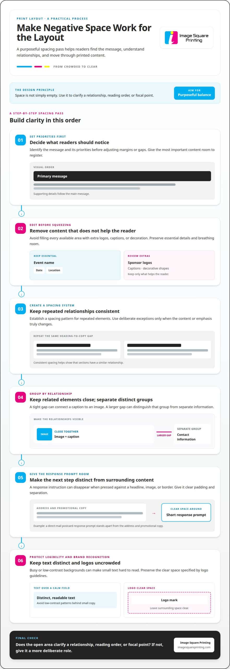
Negative space can clarify a layout, but empty areas without a purpose can weaken it. A poster with a large blank corner may look unfinished if its headline, image, and supporting details do not form a clear composition. Designers identify the message and its priorities first, then use open space to support those elements. The goal is purposeful balance, not maximum emptiness.
The opposite mistake is filling every available area. On a custom event flyer, extra sponsor logos, captions, and decorative shapes can compete with the event name. Before shrinking margins or gaps, prioritize the content and remove information that does not help the reader. This preserves breathing room while keeping essential details, such as the date and location, easy to find.
Calls to action need space too. A button or response instruction placed tightly against a headline, image, or border can disappear into the surrounding content. Designers give the action clear padding and separation so it reads as a distinct next step. On a direct-mail postcard, for example, a short response prompt should stand apart from the address and promotional copy.
Inconsistent spacing creates another problem. If a brochure has a wide gap between one heading and its paragraph, then a tight gap between another heading and similar text, readers may assume the sections have different relationships. A designer establishes a spacing system for repeated elements, then uses deliberate exceptions to signal a real change in content or emphasis.
Excessive spacing can break connections as well as create them. A product photo separated from its caption by a broad empty area may seem unrelated, even if they belong together. Designers group related elements closely and create larger gaps between separate groups. This contrast makes the layout easier to scan without extra lines or decorative dividers.
Finally, negative space should not compromise legibility or brand recognition. A low-contrast background pattern behind small text can make a brochure hard to read, while crowding a logo can change how its shape is perceived. Designers keep text distinct from busy imagery and preserve the clear space specified by logo guidelines. The practical test is whether the open area clarifies a relationship, reading order, or focal point. If not, it needs a more deliberate role.
3. Effects on readability and legibility
Readability describes how easily someone follows a passage; legibility describes how clearly they can distinguish its characters. On a printed event flyer, a reader may identify a bold headline quickly but struggle with the supporting details. Spacing affects both. Room around text helps people process information, while clear letterforms and separation make words easier to recognize.
Typography has its own negative space. Letter spacing controls the gaps between characters, and line height sets the space between lines. If either is too tight, letters or lines can run together visually. A compact product label, for example, may be difficult to scan when its description sits in dense lines beneath a narrow headline.
Designers consider type size, contrast, and viewing distance together. A poster viewed from across a room needs different text treatment from a brochure held close. If small type sits over a detailed photograph, parts of the letterforms can disappear into the image. A calmer background around the copy helps keep each character visible.
Negative space also affects printed apparel designs, where viewing distance and fabric texture matter. For direct-to-film apparel designs, fine negative-space channels may be difficult to read on left-chest logos smaller than 4 inches wide. Designers assess whether narrow gaps remain distinct at the intended scale, rather than relying only on how clear the artwork looks enlarged on screen.
For these apparel designs, the composition should read clearly at a typical viewing distance of 2-5 feet. Text needs adequate letter spacing and contrast against its background. Designers also avoid placing it over complex or busy elements. A narrow gap inside a letter might look crisp on a monitor, then appear muddy or merged when viewed on textured fabric.
Print professionals evaluate these details in context. They consider the final format, amount of copy, background, and how viewers will encounter the piece. For a brochure, they check whether headings and body text remain distinct across panels. For apparel, they assess fine gaps at the intended size and viewing distance. Giving text breathing room can reduce reading effort and help viewers process and retain the message. A layout succeeds when spacing supports the words rather than competing with them.
At the layout level, adequate negative space between elements can make text easier to read and reduce reading effort. It gives each part of a composition room to register, without making readers sort through crowded material all at once. The goal is not simply to leave empty areas, but to use spacing so text remains distinct from nearby forms and supporting details.
In typography, micro negative space includes letter spacing and line height. These adjustments work within the text, preserving separation among characters and lines at the intended scale. For DTF apparel designs, text should have adequate letter spacing, contrast with its background, and avoid complex or busy design elements behind it. Together, these checks tie spacing decisions to how the design will be seen, rather than treating open space as decoration alone.
4. How negative space supports visual hierarchy
Negative space helps readers decide what to notice first, next, and last. In a concert poster, open space around the performer’s name can make it more prominent than the venue details. That contrast establishes reading order without adding arrows or labels. Designers use spacing alongside type size, color, and placement to make the intended reading path clear.
Hierarchy starts with the message’s priorities. On a real estate yard sign, the property message or agent name may need to lead, while a phone number supports the next step. A designer can group the main message and name, then separate the contact details with a clear gap. The spacing gives each group a role and keeps the sign from reading as one undifferentiated block.
Alignment adds structure to that sequence. Imagine a flyer with a left-aligned headline, image, short description, and response details. When each element follows the same edge, readers can scan down the page more easily. Consistent gaps reinforce the order, while a deliberately larger gap can signal a shift from the main offer to supporting information.
Negative space can also direct attention through a composition. On a product poster, a headline above an image can lead the eye toward the product, while open space around a call to action makes it easier to spot. This active space emphasizes the action without making every element compete through bold color or oversized type.
The amount of open space influences tone as well as order. A product announcement with generous space around its image may feel calm and premium. A news-style layout with compact sections can suggest dense, rapidly changing information. Neither approach is automatically better; spacing should suit the message, audience, and format.
Effective hierarchy also depends on relationships between elements. Keeping a caption near its photograph in a brochure panel shows that they belong together; a larger gap before the next section marks a new topic. Designers balance occupied and open areas across the full layout, not just around one headline. This creates pacing, with quieter sections giving readers a visual pause before the next key message.
For print layouts, the practical test is the intended viewing sequence. A designer considers what should attract attention first, then adjusts spacing to support the next visual step. On a tabletop display, for example, a brief headline needs to register before secondary copy. The resulting hierarchy gives each element a clear purpose and makes the design easier to navigate.
5. Negative space in print and graphic design
Print and digital designs share spacing principles, but they behave differently. A printed poster has a fixed size and composition; a digital page may reflow across screens. Designers therefore assess print at its final format, considering how margins, images, and text will appear together on the physical piece.
Professionals use negative-space techniques by arranging positive space, such as headlines and images, against open areas. In a print advertisement, a clear field around a product can make its shape more expressive. In editorial design, column gaps and paragraph spacing help distinguish the article, captions, and sidebars without extra decoration.
Trim, bleed, and safe zones shape where open space can sit. Trim is the intended cut edge; bleed lets artwork extend beyond it, while the safe zone keeps important content away from the cut. Designers place essential text and logos inside the safe area, then position backgrounds that reach the edge to account for trimming.
To test negative space in a print proof, professionals review the design at its intended size and inspect the relationships between elements. They check whether the headline remains distinct, captions stay connected to images, and the trim leaves the composition balanced. A proof viewed only as an enlarged screen image may not show how the layout reads in its final context.
Effective examples appear across print formats. An advertisement can isolate a product against a simple field, giving the image room to command attention. An editorial spread can use a wider gap between the main article and a sidebar, while keeping each caption close to its photograph. A poster can also use open areas to create a shape that interacts with its headline or illustration.
These decisions connect composition to production. A designer considers the format, viewing context, content hierarchy, and finishing boundaries before settling the spacing. For a large-format poster, that means keeping the focal image clear while ensuring important copy remains safely positioned. Explore print design options for layouts that need a deliberate balance of open space and visual impact.
In graphic design, negative space is commonly used in logos, illustrations, posters, and creative lettering to make key objects more expressive. Positive space consists of content such as headlines, product images, and checkout buttons; negative space includes surrounding margins and gaps. These open areas need not be passive: they can form shapes and patterns that interact with positive elements, making the surrounding field part of the design rather than merely a separator.
The amount of negative space can help set a design’s tone. News home pages may use less white space than blogs to suggest dynamically appearing information, showing how spacing can support a particular impression. Designers can use spacing to create pacing, tension, and release, shaping how viewers encounter each element. They can also align items and make a layout cleaner and more organized. In print, open areas can emphasize key objects, strengthen relationships between forms, and keep elements orderly while patterns interact with the composition.
Image Square Printing: Gatorboard Prints
Image Square Printing can bring a carefully composed layout into physical form with Gatorboard Prints. This is a natural next step when your design relies on clear spacing, a strong focal point, and supporting details that remain easy to scan. For example, a presentation graphic can give its headline and central image room to stand apart while keeping secondary copy visually connected.
Share the finished artwork and its intended use so the print can support your layout’s priorities. If the design calls for a different display format, Retractable Banner Stands and custom wall covering are also available options.
Contact Image Square Printing to discuss your Gatorboard Prints project.
Give your next print piece room to work
A strong layout begins with a clear purpose. Before production, decide what viewers should notice first, what information supports that message, and where they’ll encounter the finished piece. Those choices help shape a composition that feels deliberate in its actual setting, not just attractive on screen.
Using negative space in print design is most effective when spacing supports both the message and the format. Share the intended use, essential content, and preferred visual direction so the design carries through to print. Image Square Printing offers Gatorboard Prints, Retractable Banner Stands, custom wallpaper printing, and custom wall covering for different display needs.
A considered layout can make your message easier to approach and more memorable. Discuss your print project with Image Square Printing and take the next step toward a polished design.
Frequently Asked Questions
What Is Negative Space in Design?
Negative space is the unoccupied area that helps a design’s parts read as a whole. On a restaurant menu, for example, a clear gap can separate a dish name from its description and price, helping diners scan choices without confusing one item with another. Designers can treat open areas as deliberate shapes, using them to create separation, suggest relationships, or make a simple symbol more distinctive.
What is negative space in print design?
In print design, negative space is the open area surrounding or contained within printed content. Using negative space in print design means considering how that area works on the finished item, whether it’s a folded menu, postcard, or event handout. A postcard, for instance, needs room for its central message and supporting details while also accommodating the practical information required for mailing.
How do professional designers balance negative space with text and images in brochures and posters?
Professional designers balance space by matching content to how people will use each piece. A brochure can devote one panel to a detailed explanation and another to a large image, while maintaining clear relationships between related captions and visuals. A poster viewed from a distance needs a distinct focal point and limited supporting copy. The format and purpose guide how much room each element receives.
What are common negative-space mistakes in print layouts?
Common mistakes include leaving empty areas without a clear purpose, crowding key details, and separating information that belongs together. On a restaurant menu, a wide gap between a dish name and its description can make them seem unrelated. On an event poster, placing essential details over a busy image can undermine clarity. A useful review asks whether each space supports connection, distinction, or emphasis.