

The right color can do more than make a printed piece look polished. The psychology of color in marketing prints is about using color associations to shape how people perceive a brand, notice information, and respond to a message. Blue can suggest trust and stability, while red can create energy and urgency, but the best choice depends on the brand and the goal.
Color choices matter, and they must work beyond the screen. A shade that looks vivid in a digital design may appear different on paper or another print surface, so choose a palette that supports both the intended impression and the final format.
This guide explains how color psychology works, how to align colors with marketing goals, and how to create consistency across digital and printed materials. It also covers audience perception, contrast, and print proofs, which all matter when translating a creative direction into a clear, cohesive visual identity.
Key Takeaways
- Choose colors that fit your brand’s personality and the impression you want your audience to take away.
- Match your palette to the marketing goal, using contrast and color relationships to guide attention without overwhelming the message.
- Consider audience perceptions and cultural context when selecting colors for campaigns aimed at different groups.
- Keep your palette consistent across digital and printed materials, while accounting for how print surfaces and methods can affect color appearance.
- Use Gatorboard Prints when you want to bring a color-led design into a physical display.
What is Color Psychology?
Color psychology explores how color can shape perception, emotion, and responses to a message. A common mistake is treating color associations as universal. A palette that clashes with a brand or audience can weaken the impression a printed piece is meant to create.
Color and Brand Recognition
Color supports brand recognition by giving people a consistent visual cue to associate with a business. A Pantone Color Institute study states that hue can enhance brand recognition by up to 87%.
This matters when people encounter a brand across different materials, such as a brochure, poster, or event display. Repeating a deliberate palette connects those separate encounters. Changing the dominant color without a clear reason can make the brand harder to recognize.
Industry-Based Color Strategies
Industry-based color strategies align a palette with the qualities a brand wants people to associate with its products or services. Luxury brands may use black or gold to suggest sophistication and exclusivity, while health and wellness brands often choose green for its associations with nature, growth, and health.
Fast-food marketing may use vibrant red and yellow to attract attention and encourage quick decisions. These are starting points, not fixed rules. A wellness brand can choose another palette if it better expresses its identity, and a luxury brand should use black only when it suits the experience its audience expects.
Choosing Colors for Marketing Materials
Choosing colors for marketing materials means weighing the brand’s personality, industry, subject, and intended audience together. A campaign for an organic product might use green and earth tones to reinforce a connection with nature, while a formal event could use black to create a more elegant impression.
Apply the same reasoning to logos, brochures, posters, and other promotional materials. Decide what the piece needs to convey first, then select colors that support that message and the brand’s existing identity. For a character-led campaign, a life-size cutout stand design can carry the same palette into a physical display.
Black in High-End Branding
Black can make a strong choice for high-end branding because it may convey sophistication, power, and exclusivity. For example, a luxury product brochure might use black as a prominent background or accent to establish a formal visual tone.
Its effect depends on the overall design. Black can overpower a message if it reduces text readability or competes with product imagery, so balance it with clear typography and intentional contrast. Use it consistently across related materials when it genuinely reflects the brand, not simply because luxury brands often do.
Adapting color choices to different marketing objectives
A palette should serve the task, whether a printed piece builds recognition, explains an offer, or prompts action. Format matters too: a business card and a folder offer different amounts of space and have different reading distances and color needs.
Color and Buying Choices
Color can influence buying choices by shaping a product’s visual impression before someone studies its details. In a promotion, red or orange can make a call to action stand out, while yellow can add warmth and draw attention to a specific offer.
Use color to support the decision the piece invites, not to replace clear information. A folder introducing a professional service may need a restrained palette that supports credibility, while a product-focused insert can give a featured item more visual emphasis. Color should reinforce the offer and brand, not imply qualities the product doesn’t have.
Business cards have limited space, so a focused palette can make the name and contact details easier to scan. On folders, color can distinguish the cover from interior information and establish a clear visual hierarchy.
Testing and Refining Colors
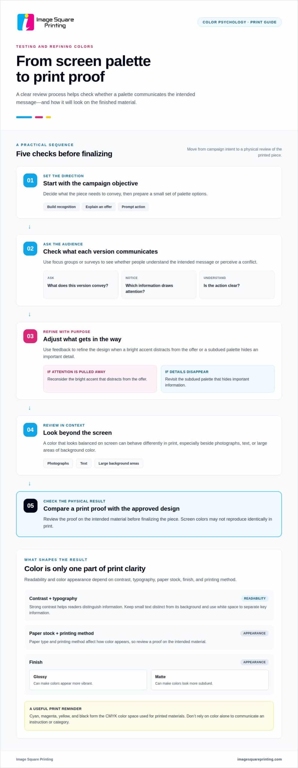
Testing and refining colors means comparing how a palette works with real people and in its intended format. Since responses to color are subjective, focus groups or surveys can reveal whether an audience sees the intended message or a conflicting one.
Start with the campaign objective and prepare a small set of palette options. Ask participants what each version conveys, which information draws attention, and whether the action is clear. Refine the design if feedback shows that a bright accent distracts from the offer or a subdued palette hides an important detail.
Then review the design in context. A color that looks balanced on screen can behave differently in print, especially beside photographs, text, or large areas of background color. Compare a physical proof with the approved design before finalizing the piece.
Print Readability and Color Appearance
Readability and color appearance depend on contrast, typography, paper stock, finish, and printing method. Strong contrast between text and its background helps readers distinguish information. Don’t rely on color alone to communicate an instruction or category.
Paper and finish can change the visual result. A glossy finish can make colors appear more vibrant, while a matte finish can make them look more subdued. Paper type and printing method also affect color, so review a proof to assess the palette on the intended material.
Folders and business cards need readable details as well as strong branding. Keep small text distinct from its background, and use white space to separate key information. Cyan, magenta, yellow, and black form the CMYK color space used for printed materials, so screen colors may not reproduce identically in print.
Three-dimensional printing adds depth to color choices: a design can be considered across visible surfaces, not just a flat layout. Plan how colors relate across those surfaces so the visual message remains coherent. For a compact printed format, explore business card printing as one way to apply a focused palette.
How color can influence emotions and customer behavior
Color can shape the emotional tone of a printed message and influence what readers notice first. Its effect depends on the surrounding imagery and words, as well as the action the design asks someone to take.
Warm and Cool Color Associations
Warm and cool colors create different emotional cues that help set a campaign’s mood. Red, orange, and yellow can bring energy, excitement, or happiness to a promotional design, while blue, green, and purple can feel calmer and more stable.
That contrast matters when a printed message has a specific job. A vibrant orange event poster may feel lively and immediate, while a blue information sheet can support a more composed impression. These associations can guide design, but they don’t guarantee the same response from every reader.
Use the surrounding elements to refine the emotional effect. A red headline paired with concise sale copy can signal urgency; the same red in a quiet, spacious layout may feel less forceful. Color works with wording, imagery, scale, and placement, rather than acting alone.
Emotional Effects of Color
The emotional effects of color describe how visual choices can connect a message with a feeling or expectation. This matters because a reader’s first impression can influence whether they pause, keep reading, or act on a printed offer.
People take 90 seconds to make a subconscious judgment about something. A study cited in Management Decision reports that color alone contributes up to 90 percent of the information forming a person’s decision after a product’s first impression. These figures point to color’s potential influence, not a guaranteed purchase.
Match the emotional tone to the next step. A sale flyer can use a bold accent to draw attention to its call to action, while a spa brochure can use a quieter palette to support a message about relaxation. For a luxury product, restrained color and careful spacing can reinforce a premium impression more effectively than competing accents.
Check that the color, copy, and imagery send the same message. If a vibrant red design promotes a calming service, the contrast may confuse readers unless the layout clearly explains the offer. A print campaign feels more coherent when its emotional cues support the subject, from the headline to the final action.
Consider the audience’s context as well. A color’s meaning can vary between people, so one palette may not create the same response across every group. For a campaign aimed at a specific audience, feedback on sample designs can reveal whether the intended emotions come through before the final materials are produced.
Color consistency across marketing materials
A consistent palette helps people connect separate campaign pieces to the same brand. A practical system keeps core colors recognizable while allowing the format and audience to shape the details.
Start by identifying the colors that should remain recognizable across every piece, then define supporting colors for emphasis and backgrounds. For example, a business might use the same deep blue on a brochure, event display, and yard sign, while reserving orange for a short promotional callout. This creates continuity without forcing every layout into the same arrangement.
Consistency doesn’t mean every printed item will look identical. Paper type, substrate, and printing method can affect how a shade appears, so a color that looks rich on one material may seem lighter or less saturated on another. Consider the intended surface when building the palette, especially if a campaign spans small handouts and larger displays.
Reviewing proofs helps align colors across materials before a campaign goes into production. Compare the key brand colors and the contrast between text and background, not just the overall impression. If a logo’s blue looks noticeably different on a brochure and a display, adjust the design or production specifications so the pieces feel connected.
Cultural context matters too. In certain Eastern cultures, red can symbolize luck and prosperity, while in Western cultures it may represent passion or danger. These associations can affect how an audience interprets a campaign, so a palette suited to one market may carry a different meaning elsewhere. Brands targeting multiple countries can use local studies to understand audience perceptions before finalizing campaign colors.
Make color decisions with the campaign’s audience and purpose in view. A wellness organization focused on growth might use green as a recognizable brand cue, while an orange accent makes a particular event announcement stand out. The accent should support the message, not replace the established identity. This distinction lets a campaign introduce a special offer while preserving familiar visual signals.
Use a simple review across the full set of materials:
- Compare primary and supporting colors across each format.
- Check whether important text and calls to action remain distinct.
- Consider cultural interpretations for each intended audience.
These decisions help keep a multi-piece campaign coherent without making every item identical. A consistent palette provides a recognizable foundation, while the format, message, and audience determine how each piece uses it.
Color psychology in digital printing
Digital printing turns a designed palette into physical color, shaping how consumers perceive quality and brand character. The psychology of color in marketing prints starts with the intended audience and message, then considers how the selected colors work in the final format.
RGB and CMYK create color differently. RGB combines red, green, and blue light for screens; CMYK uses cyan, magenta, yellow, and black inks for print. A bright turquoise in a digital design, for example, may not reproduce identically in CMYK. Prepare artwork with its print destination in mind, then review how key colors appear in a physical proof.
This difference matters when packaging or campaign materials depend on a distinctive brand shade. If the signature color shifts between a website and printed packaging, people may see the pieces as less connected. The psychology of color in marketing prints therefore includes production choices, not just the original design. Assess the printed color alongside the logo, imagery, and nearby text to see whether the intended hierarchy remains clear.
Color relationships can also guide attention. Complementary colors sit opposite each other on the color wheel and create contrast, while analogous colors sit beside one another and create harmony. Triadic colors are evenly spaced and can add vibrancy. For example, a complementary accent can highlight one package detail, while a quieter analogous palette can keep supporting information visually unified.
A distinctive accent can stand out against more uniform surrounding hues, a principle known as the Isolation Effect. On a product package, one accent color might emphasize a feature or instruction without competing with the product image. The psychology of color in marketing prints is most effective when the focal point helps consumers understand the product and supports the campaign’s goal, rather than serving as decoration alone.
Use a focused review to connect design intent with printed results:
- Define the target message and the information readers should notice first.
- Choose color relationships that establish hierarchy and keep text readable.
- Review a physical proof for color appearance and alignment with digital materials.
These practices help make color a functional part of digital printing. A package can use contrast to highlight one benefit, while a coordinated palette keeps other details easy to follow. Evaluate the full design at its intended scale, since the relationship between color, imagery, and text determines whether the message reads as intended.
Bring your print color choices to life with a design prepared for its audience and physical format.
Image Square Printing: Gatorboard Prints
Image Square Printing produces Gatorboard Prints for businesses that want to bring color-led artwork into a physical display. They can suit presentations, promotional settings, and other spaces where a printed visual needs to support a clear message.
Choose colors with viewing distance, contrast, and brand consistency in mind. For example, a bold accent can draw attention to a headline, while a calmer background gives supporting details room to read. Aligning the palette with related campaign materials helps the display connect with the broader brand.
Image Square Printing also offers Retractable Banner Stands, Custom wallpaper printing, and Custom wall covering for other display needs. Contact Image Square Printing to discuss Gatorboard Prints for your project.
Turn Your Color Direction Into a Print Plan
Use your next campaign to turn a color direction into a coordinated print plan. The psychology of color in marketing prints is most useful when each design choice serves a clear purpose, from establishing a focal point to carrying a visual identity into a physical space. Start with the message you want people to remember, then decide how color can support it across the formats they’ll encounter.
Image Square Printing can bring that direction to life in formats such as Retractable Banner Stands, Custom wallpaper printing, and Custom wall covering. Share your campaign’s visual priorities and intended application to start shaping a cohesive print solution.
Contact Image Square Printing today to discuss your project and take the next step toward print materials that reflect your brand with intention.
A considered palette gives your next campaign a strong creative foundation. Move forward with a clear message and a visual direction ready to make an impression.
Frequently Asked Questions
How does color psychology influence consumer behavior in marketing print materials?
Color influences consumer behavior by helping printed messages attract attention, signal priorities, and set expectations. In a direct-mail piece, for example, a colored offer panel can distinguish a promotion from product details and guide readers through the layout. Color supports the message rather than making the decision for someone. Pair it with clear copy and a visible next step so readers understand the offer and how to respond.
What emotions and meanings are commonly associated with colors in U.S. marketing?
In U.S. marketing, red is commonly associated with urgency or passion, blue with trust, green with nature and growth, yellow with warmth and optimism, and black with sophistication. These meanings offer familiar cues, not a fixed code. A red sale notice and a red formal invitation use the same color for different purposes. The surrounding design, product, and wording shape how people interpret each printed message.
How do color associations vary by culture, age, gender, or industry?
Color associations vary with cultural context, audience experience, and the category being marketed. Red, for instance, can suggest luck and prosperity in certain Eastern cultures, while Western audiences may connect it with passion or danger. Age and gender alone don’t reliably determine a person’s color preferences. For a campaign aimed at a defined audience, use relevant feedback and context instead of demographic stereotypes or broad assumptions.
Which color combinations work best for brochures, flyers, and direct mail?
The best combination depends on the material’s purpose and reading order. A brochure can use a calm base, such as navy and white, with one contrasting accent for section titles. A flyer promoting an event can use a brighter accent against a simpler background. For direct mail, reserve the most noticeable color for the offer or response instruction. Keep body copy distinct from its background so essential details remain easy to scan.
How can brands choose a print color palette that matches their identity and target audience?
Start with the brand’s established visual identity, then assess whether its colors suit the campaign’s audience, subject, and intended action. Assign clear roles: a primary color builds brand recognition, a supporting shade organizes information, and an accent highlights a priority. For example, a family-focused education flyer and a formal financial-services brochure need different visual tones. Keep the palette purposeful, and avoid adding colors that compete with the brand mark or message.
How can marketers test whether print colors improve engagement or response rates?
Compare two print versions that differ only in color, keeping the offer, copy, format, and distribution conditions consistent. Give each version a distinct response route, such as a unique QR code or promotion code. Then compare scans, inquiries, or redemptions over the same campaign period. This isolates color as the main design difference and connects responses to each version. Use the result to guide future creative decisions, not as a guarantee of performance.