Imagine walking into an event and being instantly captivated by a banner that sets the tone for the entire experience. That’s the magic of well-designed Oscar Banner event banners! Whether you’re planning a corporate conference, a vibrant festival, or a cozy wedding, creating a banner that catches the eye is crucial.
But how exactly do you make your banner stand out from the crowd? It’s all about blending color, typography, and visual balance to create an unforgettable impact. With the right techniques and a sprinkle of creativity, your banner can become the star of the show, drawing people in and igniting their curiosity.
In this guide, we’ll dive into the art of designing Oscar-worthy banners that not only grab attention but also convey your event’s personality. From choosing the right color palette to mastering the art of layout, you’ll discover everything you need to turn your vision into a stunning reality.
Understanding the Impact of Oscar Banners on Event
Branding
When it comes to event branding, your banner is more than just a decorative piece—it’s a vital tool for communication. This one visual component can amplify your brand’s message and set the stage for what attendees can expect.
Oscar banners have a unique way of conveying stories and emotions. A thoughtfully designed banner can evoke excitement and anticipation, acting as a silent yet persuasive ambassador of your event’s identity.
The Art of First Impression is an Oscar Banner
First impressions are everything, especially at events. An engaging banner instantly captures attention and creates a memorable experience. It’s a chance to showcase your brand’s essence and to make attendees feel like they’re stepping into a thoughtfully curated environment.
Engaging Your Audience with your Oscar Banner
A compelling banner not only attracts attendees but also encourages them to interact and engage. Whether it’s snapping selfies or sharing the image across social media, a standout design can multiply your event’s reach non-stop.
In essence, Oscar banners can be a game-changer for your event branding strategy. By investing effort and creativity into your design, you breathe life into your event, making it not just seen but remembered.
Choosing the Right Color Scheme for Maximum Visual Appeal
Picking the right color scheme for your event banner can seem like a daunting task, but it’s crucial for drawing in viewers and communicating your message effectively. Colors can evoke emotions and build connections even before a word is read.
Start by considering the mood you want to set for your event. Is it a glamorous gala, a serious conference, or a fun party? The colors you choose should reflect this atmosphere. For instance, golds and deep blues often add a touch of luxury, while bright colors like yellows and reds can create a lively, vibrant feel.
Harmonizing with Your Brand
Aligning your color scheme with your brand isn’t just a trend—it’s a strategy. Using your brand’s existing colors fosters brand recognition, making your event unmistakably yours. It’s like a visual handshake that tells attendees they’re in the right place.
Another thing to keep in mind is contrast. Do you want your banner to stand out? Opt for contrasting colors that make text pop and attract attention from across the room. Just be careful not to overdo it—you want striking, not blinding.
In the end, the perfect color scheme does more than just look good; it supports your event’s message and enhances the overall experience for your guests. Choose wisely, and your banner will be a visual anchor at your event.
Incorporating Engaging Typography Techniques
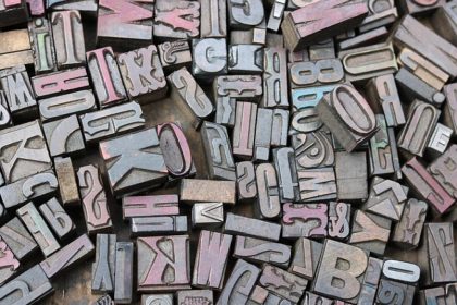
Typography is more than just picking a random font—it’s about giving your words a personality. The right typography can amplify your message and guide the viewer’s focus effortlessly.
First off, consider readability. It’s crucial. No one wants to squint to make out your text. Choose fonts that are clear and easy to read, even from afar. A good rule of thumb is to stick with sans-serif fonts for headlines and serif fonts for the body text if your banner involves longer reads.
Mixing fonts can add flair, but proceed with caution. Limit yourself to two or three different fonts to maintain a cohesive look. This distinction helps create contrast and highlights the most important information without overwhelming your audience.
Adjusting font size can also create impact. Make sure the most crucial details, like the event name and date, are in the largest and boldest fonts. This not only makes them pop but also ensures they’re remembered.
In the end, typography is like the spice of your banner—it enhances flavor without overpowering the main dish. When done right, it can transform a good banner into a great one.
Utilizing High-Quality Images and Graphics for Wow Factor
Images and graphics can be the game-changers for your banner design. They’re the hooks that capture attention and make people stop in their tracks.
Always aim for high-resolution images. Blurry or pixelated visuals can dilute your message. Crisp, clear images make your banner look more professional and inviting.
Choosing the Right Visuals
Choose images that resonate with your message. They should align with the theme or mood of your event. A cohesive look enhances brand recognition and makes your message more memorable.
Remember, the quality of your visuals reflects the quality of your brand. Investing in professional photography or using premium stock image services can elevate your design from ordinary to extraordinary.
Graphics, like icons or vector images, should also be strategically placed to enhance your message. They can guide the eye, emphasize points, or simply add an extra flair.
In the end, pairing high-quality images and graphics with your message creates a powerful combo. It’s the secret sauce that makes your banner not just seen, but remembered.
Creative Layout Design Principles for Oscar Banners
Designing an Oscar banner is like storytelling through imagery. Every element should have its place and purpose, drawing the audience into your narrative.
Start with a grid layout. It’s a simple yet effective way to organize information. The grid helps maintain balance and ensures your banner doesn’t become chaotic.
Prioritizing Content
Identify the key message and let it take center stage. Whether it’s the name of the movie, an iconic image, or a tagline, ensure it’s the hero of your design.
Contrast is your friend. Bold colors against muted backgrounds, large fonts for key phrases, and strategic white space all help guide the viewer’s eyes.
Experiment with layers. Overlapping images and text can add depth, making your banner more dynamic and intriguing.
Keep proportions in mind. A layout that respects the proportionality of elements helps maintain harmony and ensures the focus isn’t lost.
The Oscar banner should evoke elegance and luxury. Simple, sleek design choices can convey the prestige and excitement associated with Hollywood’s most glamorous night.

Implementing Effective Call-to-Actions for Event Success
Creating a compelling call-to-action (CTA) can transform interest into engagement. It’s the nudge that turns a passive glance into active participation.
Make your CTA visible and enticing. Use contrasting colors and bold fonts to make it stand out from the rest of the content. A CTA should catch the eye at first glance.
Crafting the Message
Keep the message clear and concise. Action words like “Join Now,” “Reserve Your Spot,” or “Get Your Tickets” convey urgency and motivate users to act quickly.
Ensure your CTA communicates value. Why should someone click? Offering incentives like early bird discounts or exclusive content can make your CTA irresistible.
Positioning plays a crucial role. Place your CTA in multiple locations without overdoing it. Top and bottom of the page are popular spots, but also consider a pop-up or a sidebar for extra emphasis.
Test different CTAs to see which performs best. Changing the text, color, or placement can significantly impact engagement levels. Monitor and adapt to maximize effectiveness.
A well-placed and thoughtfully crafted CTA is the bridge between your event and its success. Give it the attention it deserves, and watch engagement levels soar!
Optimizing Oscar Banners for Different Event Types
Creating banners that shine for any event type is an art. Each event has its vibe, and your banner should reflect it perfectly.
For a glamorous gala, think golds, deep reds, and rich textures. Use elegant fonts and luxurious imagery to create a sense of exclusivity.
For a more casual gathering, opt for bright and cheerful colors. Playful fonts and lively images can convey excitement and approachability.
If it’s a professional conference, keep it sleek and minimalistic. Neutral tones and clean lines with clear text project a sense of confidence and professionalism.
The key is alignment with the event’s theme and audience. Audience recognition of visual cues can build anticipation and resonate with their expectations.
Always consider where the banner will be displayed. Digital screen banners need a different design approach than printed ones, focusing on readability and scale.
Consistency with other marketing materials is crucial. Ensure fonts, colors, and images align with the overall theme to maintain a cohesive look across all platforms.
With these tailored touches, your Oscar banners can hit the mark, capturing attention while setting the perfect tone for every type of event you host.
The Bottom Line: Bringing Oscar Banner Designs to Life
Bringing Oscar banner designs to life is all about balancing creativity with purpose. Each element, from the color palette to the font choice, plays a crucial role in capturing the essence of the event you’re celebrating.
As we’ve explored, the foundation of a standout banner lies in understanding the event type and audience expectations. By carefully considering these factors, you can design banners that not only engage but also resonate deeply.
Another key point is, embracing technology allows for exciting innovations in banner design. With digital tools, you have the power to experiment and refine your designs, ensuring they are both eye-catching and effective.
Consistency across all promotional materials is key. When every piece, be it digital or print, shares a unified theme and message, it strengthens brand recognition and creates a seamless experience for your audience.
Remember, the final product should invite viewers in, intrigue them, and ultimately, enhance their overall experience of the event. A well-crafted Oscar banner can do just that, leaving a lasting impression long after the event concludes.
In conclusion, let your creativity flow, but keep your intent clear. With the right balance, your Oscar banners can passionately convey the spirit of the celebration, turning an ordinary event into an unforgettable one.
Image Square Printing


