Imagine strolling down the street and suddenly, a vibrant poster grabs your attention. That’s the power of a well-designed wheatpaste posters also known as street poster! These visual gems can stop people in their tracks, convey a message in seconds, and leave a lasting impression.
Creating eye-catching street posters isn’t just about throwing together some flashy images and bold text. It involves a mix of creativity, design principles, and understanding your audience. From choosing the right colors to crafting compelling messages, every detail matters.
Ready to master the art of street poster design? Let’s dive into the essential tips and tricks that will help you create posters that not only catch eyes but also captivate hearts.
Understanding the Basics of Street Poster Design
Creating an eye-catching street poster starts with understanding the fundamentals of design. The very first element to consider is clarity. Your message should be easy to read at a glance. Think bold, large fonts for headlines, and keep secondary text concise.
The Power of Color
Color is your best friend when it comes to making your poster stand out. Use contrasting colors to make important elements pop. But be wary of using too many colors, which can overwhelm the viewer. A good rule of thumb is to limit your palette to two or three main colors.
Imagery also plays a crucial role. A high-quality image can convey emotions and capture attention quickly. Always use high-resolution images and ensure they align with the tone and message of your poster.
Balancing Act: Layout
Your layout should guide the viewer’s eye towards the most important information. Utilize design principles like symmetry, balance, and alignment to create a harmonious look. Don’t cram too much information into one space; white space is essential for readability.
Finally, consider your audience. What appeals to them? Tailor your design to match their interests and tastes. By understanding these basics, you’ll lay a strong foundation for an eye-catching street poster that resonates with viewers.
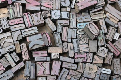
Selecting the Right Colors and Fonts for Maximum Impact
Choosing the right colors and fonts can make or break your street poster. Colors evoke emotions, so think about the feelings you want to ignite in your audience. Warm colors like red and yellow grab attention but can be overwhelming if overused. Cooler shades like blue and green bring a calming effect and balance.
When it comes to fonts, less is more. Stick to one or two fonts to keep your design clean. Make sure your main font is bold and easy to read from a distance. Script fonts can add elegance but avoid using them for large blocks of text as they can be hard to read.
Contrast is key. Pair a bold font with a simpler one to create a visual hierarchy. This helps guide the viewer’s eye through the poster, ensuring the important information stands out.
Lastly, think about accessibility. Ensure your text is readable against the background. High-contrast combinations like black text on a white background or white text on a dark background are always a safe bet. By smartly selecting colors and fonts, you’ll create a powerful design that stands out and communicates effectively.
Utilizing High-Quality Images and Graphics
Images and graphics are the heart of any captivating street poster. High-quality visuals draw people in and make your poster memorable. Grainy or pixelated images can make your poster look unprofessional, so always opt for high-resolution files.
Consider the mood you want your images to convey. Bright, vibrant pictures work well for upbeat events, while more subdued tones might be better for serious messages. Make sure your visuals are relevant to your content.
Graphics like icons and illustrations can help break up text and make your poster more engaging. They can also direct attention to important points. Just make sure they don’t overwhelm the design. A balanced layout is key.
Don’t forget about brand consistency. If you’re creating a series of posters, use images and graphics that share a similar style. This creates a cohesive look and reinforces brand recognition.
Lastly, pay attention to alignment and spacing. Properly spaced images and graphics can make your poster look polished and easy to navigate. With high-quality visuals and thoughtful design, your street poster will not only attract attention but leave a lasting impression.
Placement Strategies for Maximum Exposure
Where you place your street poster is just as important as the design itself. To get the maximum exposure, start by scouting high-traffic areas. Think busy sidewalks, bus stops, and popular cafes – these spots guarantee more eyes on your poster.
Next, consider the height at which you place your poster. Eye-level is always a good bet. If people have to strain their necks to see it, chances are they’ll just walk on by. Make it easy for them to notice your message.
Timing is also crucial. If you’re advertising an event, put your posters up about two to three weeks in advance. This gives people ample time to see and remember it, but not so much time that they forget about it.
Don’t overlook community boards. Many cities have designated spots for posting flyers and posters. These boards already attract people looking for local happenings, making them a prime spot for your poster.
Finally, be strategic with the number of posters. Saturate key areas without going overboard. Too many posters in one place can make your message blend into the background noise. A few well-placed posters can be far more effective than a barrage.
With smart placement strategies, you’ll ensure your street posters get the attention they deserve.
Implementing QR Codes and Interactive Elements
Adding QR codes and interactive elements to your street posters can take engagement to the next level. People love interactive content – it makes them feel involved and curious.
QR codes are a simple way to connect the physical with the digital. Link the code to your website, event page, or a special offer. Make sure it’s easy to scan; avoid placing them on dark or overly busy backgrounds.
Interactive elements can go beyond QR codes. Think about adding tear-off tabs with your contact details or discount codes. People can take a piece of your poster with them, making it more likely they’ll engage with your content later.
Consider incorporating augmented reality (AR) elements. With AR apps, users can point their smartphones at the poster and see special animations or videos. This tech-savvy approach can make your poster stand out and spark interest.
Always include a clear call to action, guiding people on what to do next – “Scan the QR code for more info” or “Take a tab and get a discount.” Clear instructions ensure people know how to interact with your poster.
Using these simple yet effective elements can significantly boost the reach and impact of your street poster campaigns.
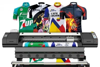
Printing Techniques for Vibrant Poster Prints
Choosing the right printing technique is crucial for achieving vibrant poster prints that catch the eye. You want your colors to pop and your text to be crisp, ensuring your message is loud and clear.
Digital Printing
Digital printing is a popular choice for small batch posters. It offers high-quality prints with vivid colors, and it’s cost-effective for low quantities. Plus, you can easily make adjustments to your design without much hassle.
Offset printing, on the other hand, is ideal for large quantities. This traditional method provides consistent color and sharp detail, making your posters look professional. The initial setup costs might be higher, but it’s economical for big print runs.
Paper Quality Matters
Don’t overlook paper quality. Glossy paper can make colors more vibrant, while matte paper reduces glare and is easier to read under different lighting conditions. Think about where your posters will be displayed and choose accordingly.
Special inks and finishes can also add a unique touch. Metallic inks or spot UV coating can highlight key areas of your design, making them stand out even more. These little extras can make a big difference in catching someone’s eye.
By selecting the right printing techniques and materials, you can ensure your posters are not only vibrant and engaging but also durable and professional-looking. It’s all about making a strong impression!
The Bottom Line: Tips for Creating Memorable Street Poster Designs
Creating memorable street posters involves a mix of eye-catching design, clear messaging, and high-quality printing. First and foremost, keep your design simple yet striking. Use bold colors and strong visuals to grab attention quickly, but don’t overcrowd your poster. Less is often more.
Next, your message should be clear and concise. People usually spend only a few seconds looking at posters, so make sure your main point stands out. Use large, readable fonts and consider adding a catchy headline that gets straight to the point.
Don’t forget the importance of quality printing. A vibrant, well-printed poster can make a huge difference in how your design is perceived. Choose the right paper and printing technique based on your needs and budget. Digital printing works great for small quantities, while offset printing is perfect for larger orders.
Think about where your posters will be displayed and choose your materials accordingly. Glossy paper can make colors pop but might glare, while matte paper offers readability under various lighting conditions.
Finally, be a little adventurous with special touches like metallic inks or spot UV coating. These extras can make certain elements of your design stand out, adding that extra wow factor.
In the end, designing a memorable street poster is about making thoughtful choices. Keep your design clean, your message clear, and invest in quality printing. Your effort will pay off when your poster catches someone’s eye and leaves a lasting impression.