Ever had a vision for a stunning poster but weren’t sure where to start?
You’re not alone. Whether you’re designing for business, events, or personal projects, quality matters. Getting that crisp, eye-catching finish requires more than just a good printer.
In this guide, we’ll explore the ins and outs of poster printing. From choosing the right paper to subtle design tips, I’ll cover everything you need to know.
Ready to make your prints stand out? Let’s dive in!
Benefits of High-Quality Poster Printing
So, why should you invest in high-quality poster printing? Let’s break it down.
First off, the visual impact. A high-quality poster grabs attention. Imagine walking by a dull, blurry image versus a vibrant, sharp one. Which one catches your eye? Exactly.
Beyond just looks, there’s durability. Quality materials stand the test of time. A good poster won’t just fade away after a few weeks. It remains vibrant and intact, ensuring your message lasts.
Improve Professionalism
Good printing conveys professionalism. Whether you’re promoting a brand, an event, or just sprucing up your space, a top-notch poster says you care about the details. It reflects a commitment to quality that’s hard to ignore.
A high-quality poster also enhances readability. Crisp text and clear images mean your audience can easily read and understand your message. No squinting or second-guessing needed.
Another perk? Versatility. With quality printing, you can use your posters for various purposes. From retail displays to educational tools, a well-made poster is as functional as it is beautiful.
Finally, let’s not forget about first impressions. Your poster might be the first thing people see about your event or product. Make it count. A high-quality print sets the stage for a positive initial reaction.
In short, high-quality posters are an investment. They offer better aesthetics, longevity, and a professional edge. That’s a lot of benefits packed into one print.
Key Factors to Consider Before Printing Posters
Before you dive into printing your posters, there are a few key factors to keep in mind.
First, consider your audience. Who are you trying to reach? Knowing your target audience can help you design something that appeals directly to them.
Next, think about the size. Posters come in all shapes and sizes, so choose one that suits your needs. Larger mural posters are great for outdoor advertisements, while smaller ones work well for in-store promotions or handouts.
Equally important is the design. A cluttered poster can overwhelm viewers. Keep it clean and focused. Use high-quality images and readable fonts.
Now, let’s talk about color. Colors can evoke different emotions and reactions. Choose a color scheme that aligns with your message and brand. Be mindful of how the colors will look in print versus on a screen.
Don’t skimp on the paper quality either. The type of paper you choose can affect the poster’s final look and feel. Thicker, premium paper often looks more professional and lasts longer.
And finally, consider the printing technique. Different techniques offer various benefits. Digital printing is great for short runs, while offset printing is better for larger quantities. Make sure to choose a method that aligns with your budget and needs.
By keeping these factors in mind, you’ll be well on your way to creating effective, eye-catching posters.
Types of Printing Techniques for Posters
When it comes to printing posters, knowing your options can make a big difference. Let’s dive into the main types of printing techniques available.
First up is digital printing. This method is perfect for small to medium print runs. It’s quick, cost-effective, and great for vibrant colors and fine details. Plus, it offers flexibility if you need last-minute changes.
Next, we have offset printing. Ideal for larger quantities, offset printing provides consistent quality. It uses plates to transfer ink onto paper, resulting in sharp and professional-looking posters. The initial setup might be more expensive, but the cost per unit decreases with higher volumes.
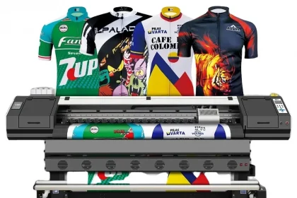
Screen printing is another popular choice. Although it’s more labor-intensive, this technique is loved for its durability and vibrant colors. It’s especially good for printing on various materials, not just paper. However, it’s usually reserved for designs with fewer colors.
For something a bit different, consider large format printing. This is the go-to for oversized posters and banners. It delivers high-quality images and can print on materials like canvas and vinyl. It’s excellent for making a big impact.
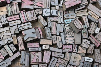
Let’s not forget about fine art poster printing. It’s a lesser-known technique but offers a unique, almost vintage look. Replication of a fine art on a textured fine art paper is called textured poster. Some textured fine art papers replicate the look of the textured papers developed for watercolor painting. Other textured fine art papers resemble the types of papers used from etched metal plates. A velvet textured fine art paper has a subtle, fine-grained texture.
By understanding these different printing techniques, you can choose the best one to meet your needs and budget. Each method has its own advantages, so weigh your options carefully.
Design Tips for Creating Eye-Catching Posters
Now that we’ve explored printing techniques, let’s talk about design. A great design is what makes people stop and take notice of your poster.
First, use bold colors. Bright and contrasting colors can draw attention from a distance. Make sure your colors are harmonious and not too jarring to the eye.
Keep your message clear and concise. Less is more when it comes to poster text. Use large fonts for the main message and keep additional details to a minimum. You want people to get your message even at a glance.
Next, simple shapes and strong lines can guide the viewer’s eye. Use them to create a visual path. This helps in directing the focus to the most important parts of your poster.
Imagery can make your poster stand out. Use high-quality images that are relevant to your message. Avoid clutter; one or two striking images are far more effective than a collage of smaller ones.
Don’t forget about whitespace. It’s tempting to fill every inch with information, but whitespace can actually make your design more powerful. It allows the main elements to breathe and makes your poster easier to read.
Lastly, consider the balance and alignment of your layout. Everything should feel cohesive and well-placed. Misalignment can make a poster look amateurish. Use grids and guides to ensure everything lines up perfectly.
With these design tips, you’ll be well on your way to creating and order eye-catching posters. Remember, practice makes perfect, so keep experimenting until you find what works best for you. Please visit our site for more information on how to order your vibrant color posters, or just give us a call to speak to one of our knowledgeable printing staff.
Choosing the Right Paper for Your Posters
Design is important, but choosing the right paper can elevate your poster to the next level. Paper choice affects the look and feel of your project, and it’s worth spending a little time getting it right.
First off, think about the finish. Glossy paper makes colors pop and gives your poster a polished look. It’s great for vivid, colorful images. On the other hand, matte paper offers a smooth, non-reflective finish. It’s ideal for designs with a lot of text or softer colors.
Secondly, consider the weight of the paper. Heavier paper feels more substantial and can withstand handling better. For posters that will be handled frequently or displayed outdoors, something around 200 to 300 GSM (grams per square meter) is a good choice. Lighter paper, around 100 to 150 GSM, works well for posters that are temporary or will be placed indoors. Use the following link, ordering your posters, to view and select all different types of poster papers that we offer. If you do not see a type of paper, simply give us a call.
When sustainability is on your mind, recycled paper is a fantastic option. It might not always have the same brightness as non-recycled paper, but it’s an eco-friendly choice that sends a positive message.
For a touch of luxury, think about special textures. Textured papers like linen or canvas can give your poster a unique feel and make it stand out even more. This is great for artistic or high-end designs.
Stick with Standard Sizes
Paper size matters too. Standard sizes like A3 or A2 are usually the safest bet because they’re easy to frame and exhibit. Custom sizes might require special printing and can be more costly.
With these points in mind, selecting the right paper becomes a straightforward task. Your choice can make a big difference, turning a good poster into a great one.
Ensuring Color Accuracy in Poster Printing
When it comes to printing posters, color accuracy is crucial. The last thing you want is for your vibrant red to turn out looking pink or orange.
One key step is to calibrate your monitor. This ensures that what you see on your screen matches the printed result. Tools for calibration can be found online, and some are even built into your operating system.
When designing your poster, use CMYK color mode. CMYK stands for Cyan, Magenta, Yellow, and Key (black), and it’s the color model used in color printing. Many designers work in RGB mode, but this is better suited for digital displays, not printing.
Print Proofs First
Before committing to a full print run, it’s smart to print a proof. This is a sample print of your poster. A proof allows you to catch any color issues and make adjustments if necessary. Most printing services offer this option, and it’s worth the extra step.
Another tip is to use high-resolution images. Images with low resolution can appear blurry or pixelated when printed. Aim for at least 300 dpi (dots per inch) to ensure everything looks sharp and clear.
Lastly, be mindful of paper choice when considering color accuracy. Glossy paper can make colors look more vibrant, while matte paper can mute them slightly. Be sure to test different types to see which suits your design best.
By following these steps, you can achieve the color accuracy that makes your poster truly stand out. A little extra effort here will pay off in the end, leaving you with a stunning and vibrant result.
Tips for Effective Poster Distribution
Once your poster is printed, the next step is to get it in front of as many eyes as possible.
First, consider your audience. Where are they likely to be? Placing your posters in high-traffic areas like coffee shops, community centers, and libraries can be incredibly effective. These spots often have bulletin boards specifically for public notices.
Another great idea is to partner with local businesses. Many are willing to let you display a poster, especially if it benefits the community or aligns with their customer base. Be sure to ask politely and offer to return to remove the poster after the event or campaign ends.
Effective distribution is key to maximizing your poster’s impact. We have a great rates with our logistic partner at UPS. Next day Coast to coast delivery including Alaska and Hawaii and even the island of Guam and Puerto Rico.
Use Digital Avenues
In today’s digital age, don’t forget about online distribution. Sharing a digital version of your poster on social media can broaden your reach exponentially. You can also add it to community forums and local event pages.
For physical posters, think about placement at eye level. People are more likely to notice and read a poster if it’s easily visible as they walk by. Avoid placing posters too high or too low on walls.
Keep track of where your posters are placed. This will help you assess which locations are most effective and make adjustments for future campaigns. A simple spreadsheet can do wonders here, marking locations and any relevant notes.
Finally, make it a point to check on your posters regularly. Sometimes they get taken down, moved, or covered by other notices. It helps to maintain visibility by ensuring your poster stays in prime condition.
With these tips, your poster is sure to garner the attention it deserves. Proper distribution can make all the difference in reaching your target audience effectively.
The Bottom Line: How to Achieve High-Quality Poster Prints
Achieving high-quality poster prints boils down to a few key factors. Start by ensuring your design is top-notch. It should be eye-catching and include all necessary information without overwhelming the viewer.
Next, choose the right materials. The type of paper and ink you use can significantly affect the final product. Opt for high-quality paper that provides durability and a polished look. Good ink ensures your colors pop and remain vibrant.
Don’t forget about resolution. High-resolution images guarantee your poster looks sharp and professional. Ensure your design file is set to the correct settings to avoid any pixelation issues.
Collaboration with a reputable print shop can make a big difference. Experienced printers can offer advice on the best materials and finishes, ensuring your poster turns out just right. They’re also equipped to handle large print runs without compromising quality.
Attention to Detail
Pay attention to the small details. Proper color calibration, bleed areas, and margins all contribute to the final quality. Don’t overlook these aspects during the design and printing processes.
Lastly, carefully plan your distribution. Place your posters in areas where your target audience will see them, and keep them in good condition to maintain their impact.
In summary, high-quality poster prints result from meticulous design, material selection, and distribution strategies. By focusing on these elements, your poster will stand out and effectively communicate your message.