Are you looking to spruce up your website or social media page with an eye-catching background banner? In this article, How to Design an Eye-Catching Background Banner, we go over few design ideas on how to make them. The background banner of any digital platform is often the first thing that catches a visitor’s eye, so it’s crucial to make it visually appealing and on-brand. In this blog post, I’ll guide you through some tips and tricks on how to design an eye-catching background banner that will make a lasting impression on your audience.
Understand Your Brand
Before diving into the design process, it’s essential to have a clear understanding of your brand identity. Your background banner should reflect your brand’s personality, values, and overall vibe. Take some time to brainstorm keywords and phrases that represent your brand. Are you aiming for a modern and sleek look, or is your brand more fun and colorful? Understanding your brand will help you make design choices that are cohesive and aligned with your overall brand image.
Choose the Right Dimensions
One of the most critical aspects of designing Eye-Catching background banner is getting the dimensions right. Different platforms have different specifications for background banners, so be sure to do your research before starting the design process. You don’t want your banner to be cut off or distorted when uploaded. Most platforms provide templates or guidelines for background banner dimensions, so take advantage of these resources to ensure your design fits perfectly.
Select a High-Quality Image
A visually striking background banner often starts with a high-quality image. Whether you opt for a photograph, illustration, or graphic design, make sure the image you choose is high resolution and visually appealing. Avoid pixelated or blurry images, as they can make your banner look unprofessional. If you’re using stock photos, consider adding your twist to make them unique to your brand.
Play with Colors
Color plays a significant role in the overall impact of your background banner. Choose a color scheme that aligns with your brand’s visual identity. You can use tools like Adobe Color or Coolors to create a cohesive color palette for your design. Consider the psychology of colors and how different colors evoke different emotions. For example, blue can convey trust and professionalism, while yellow is often associated with energy and creativity.

Incorporate Typography
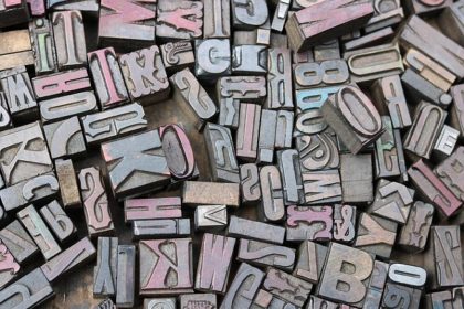
Typography can elevate your background banner design and make it more visually appealing. Choose fonts that are easy to read and align with your brand’s personality. Experiment with font sizes, styles, and colors to create hierarchy and visual interest in your design. Be mindful of legibility, especially if you’re overlaying text on your background image. Play around with typography to find a balance that works well with your overall design.
Add Graphics or Illustrations
To make your Eye-Catching background banner more unique and eye-catching, consider incorporating graphics or illustrations. These elements can add depth and visual interest to your design. Whether you choose abstract shapes, icons, or custom illustrations, make sure they complement your brand and enhance the overall aesthetic of your banner. Graphics can help guide the viewer’s eye and highlight essential elements of your design.
Keep It Simple and Minimal
While it’s essential to make your Eye-Catching background banner visually appealing, remember that less is often more. Avoid overcrowding your design with too many elements or distractions. Opt for a clean and minimalistic approach that allows your key message or visuals to shine. Simple designs are not only more aesthetically pleasing but also easier for viewers to digest and remember.
Test Different Versions
Once you’ve designed your Eye-Catching background banner, don’t be afraid to test different versions to see what resonates best with your audience. You can create A/B tests or simply gather feedback from peers or focus groups to get insight into which design performs better. Be open to making tweaks and adjustments based on feedback to ensure your background banner is as effective as possible.
Optimize for Mobile
In today’s mobile-centric world, it’s crucial to ensure that your background banner is optimized for mobile devices. Test your design on various screen sizes and resolutions to make sure it looks good and functions well on smartphones and tablets. Consider how elements like text size, image placement, and overall composition may need to be adjusted for mobile viewing. A responsive design will ensure that your background banner looks great no matter how it’s being viewed.
Use Design Tools and Templates
If you’re not confident in your design skills, don’t worry – there are plenty of design tools and templates available to help you create a stunning background banner. Platforms like Canva, Adobe Spark, or Crello offer user-friendly interfaces and pre-designed templates that you can customize to fit your brand. These tools can save you time and effort while still allowing you to create a professional-looking design.
Get Creative and Have Fun!
Designing an eye-catching background banner doesn’t have to be a daunting task. Remember to have fun with the design process and let your creativity shine through. Experiment with different ideas, colors, and layouts until you find a design that you’re proud of. Your background banner is an opportunity to showcase your brand’s personality and captivate your audience, so make the most of it!
The Bottom Line
Designing an eye-catching background banner is a creative process that requires careful consideration of your brand, visuals, and design elements. By understanding your brand identity, choosing the right dimensions, selecting high-quality images, playing with colors, incorporating typography and graphics, keeping the design simple, testing different versions, optimizing for mobile, and using design tools, you can create a background banner that stands out and leaves a lasting impression on your audience. Remember to get creative, have fun with the process, and don’t be afraid to try new ideas until you achieve a design that truly represents your brand.


